AI-powered SaaS platform for automating complex research and integrating biological data.
Type: Real client project (Early-stage startup, part of UXVision course with Yana Sverdlov & Shira Picker)
Scope: UX Research & UX Design
Goal: Design a structured, research-oriented interface for genetic mutation researchers, aligned with scientific thinking processes
Challenge
Biology researchers waste valuable time gathering and comparing scattered data instead of focusing on insights. The process is slow, manual, and spread across multiple tools.
Solution
Deriva is an AI-based platform that simplifies research by automating data collection, connecting key sources, and helping researchers reach insights faster, with clarity and confidence.
The Current State
A Day in the Life of a Geneticist
Imagine you’re a genetic researcher.
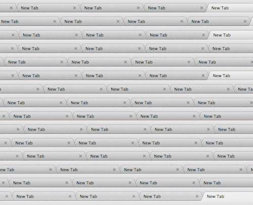
You sit down at your desk, open a dozen tabs, and curse the day you chose to study biology. “Did I really study for years just to cross-check data between different websites?” you think.
“I want to make decisions, analyze findings, and drive scientific breakthroughs — not get lost in endless manual work.”
This is the reality for many biology researchers today. The research process is slow, fragmented, and inefficient — especially when it comes to variant analysis in genetics.
The Challenge of Genetic Research
Every person carries dozens of genetic mutations — most are harmless, but a few may cause disease.
To determine which are pathogenic, researchers analyze scientific articles (e.g. from PubMed) and cross-reference data from genomic databases like ClinVar and gnomAD.
Instead of focusing on insights and discoveries, researchers spend hours searching, comparing, and verifying information.
The core issues
🗂️ Distributed- Data is scattered across multiple sources.
🚀 Rapidly expanding- The volume of information is constantly growing.
🔗 Disconnected- No integration between sources, making it hard to see the full picture.
🧩 Unstructured- Data is not organized in a way that’s easy to analyze.
Where Things Stand Today
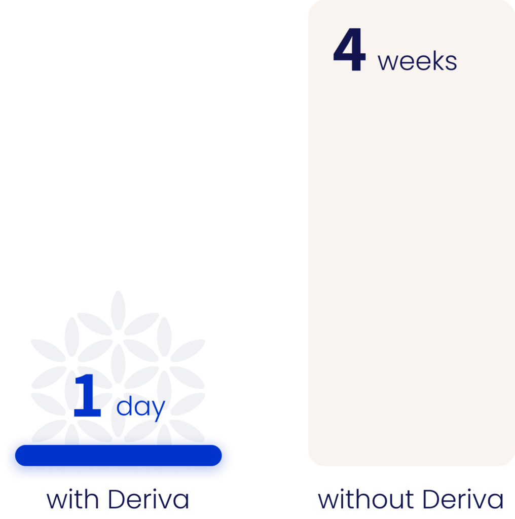
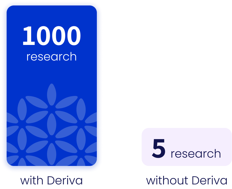
Genetic research is under pressure. The number of cases keeps increasing, as awareness grows and more people seek genetic evaluations. However, there is a critical capacity issue — not enough researchers to meet the growing need.
In one healthcare provider, 300 cases are submitted monthly, but only 50 are reviewed due to limited time and staff.
Why Deriva?
Deriva accelerates biological research through smart automation, time-saving workflows, and structured analysis of complex data — enabling researchers to reach insights faster, more efficiently, and backed by data.
How Deriva Works
📥 Data Extraction– Automatically gathers information from multiple sources such as PubMed, ClinVar, and gnomAD.
🧠 Data Processing– Analyzes the collected data using advanced tools
📊 Visualization– Presents insights through clear dashboards and graphs, including structured tables.
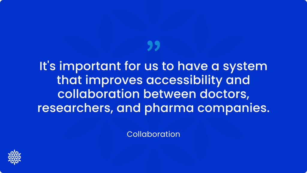
🤝 Collaboration– Enables efficient, synchronized teamwork on studies with other researchers.
The Business Challenge
Common Early-Stage Startup Challenges:
Building trust is difficult, especially with a professional and highly critical audience.
There is a need to acquire a large number of users.
Increase researcher engagement by aligning the user experience with their scientific thought process.
Deriva’s Unique Challenge
Deriva operates in a complex scientific field, where trust, accuracy, and value are essential. The real challenge is to design a user experience that makes advanced biology accessible and usable — without lowering scientific standards.
Possible KPIs:
📈 Adoption Rate
Measure how many new researchers start using the product.
✔️ Task Completion Rate
Measure how many users successfully complete the full research workflow from start to finish.
⏱️ Time to Insight
Track how quickly users reach meaningful results.
⭐ User Satisfaction
Understand how users experience the platform through feedback surveys.
Summary:
These metrics reflect different levels of user engagement — from first-time use to ongoing activity and future return.
They show how the user experience impacts researcher behavior, and how that directly supports the product’s core business challenge.
UX Goals Aligned with the Business Challenge
To build trust, attract new users, and boost engagement, the user experience must address six key challenges:
🌤️ Clarity
A self-explanatory interface that simplifies complex processes, prioritizes key content, and reduces information overload — giving users clarity and control.
🧬 Scientific Transparency
Clear display of trusted sources (PubMed, ClinVar, gnomAD) and traceable reasoning behind results to build confidence.
🧠 Alignment with Scientific Thinking
A natural interface for researchers that mirrors their systematic, source-based workflow — with documentation, cross-referencing, visual tables, and structured exploration.
🔄 Seamless Workflow (Flow)
Seamless research flow with integrated tools — analysis, sources, findings, documentation, and collaboration — all in one platform, no system switching needed.
🤝 Long-Term Engagement
Encourages full-cycle use with features like history tracking, collaboration, and easy access to past studies.
Strong in text-based responses, but lack support for structured biological data.
Latch bio
Bionl
Biology-Focused Competitors
LatchBio
Runs bio-data workflows,
but doesn’t guide research, generate insights, or work without user-uploaded data.
Doesn’t fetch data — relies on manual input.
Bionl.ai
Chats with files and finds papers,
but doesn’t guide research or prioritize findings.
Fetches info for answers — not for deep analysis.
Target audience
Biological researchers, with a focus on those studying the pathogenicity of genetic variants.
Direct quotes from interviews with biological researchers helped us understand their pain points, motivations, and expectations.
User Research Insights (Based on Survey Responses)
🧭 Guided Flow through Repeated Patterns
Researchers often ask similar questions in each analysis — so we introduced step-by-step guidance inside the chat to structure their workflow intuitively.
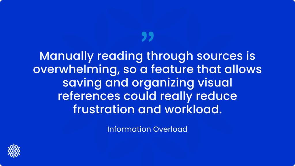
🗂️ Data Organization and Saving
Users want to save, organize, and filter their research easily, with quick access and smart search.
🧾 Presentation as a Deliverable
There’s a strong need to generate a clear summary or report including insights, sources, and research outcomes — ready for review or sharing.
🏷️ Tagging and Collaboration
Researchers highlighted the value of tagging and sharing research with colleagues directly within the platform.
📊 Structured Table View
The most effective way to view variant data is through a clean, comprehensive table showing info from multiple sources.
🎯 Single Variant Focus
Research typically focuses on one variant at a time, so the experience must support clarity and deep focus.
🔔 Alerts and Updates
Users want to receive notifications when previously analyzed variants are updated with new information.
🧬 Pathogenicity-Based Filtering
Filtering variants by pathogenicity level helps researchers prioritize and streamline analysis.
💻 Desktop-Oriented Design
Research is conducted mostly in-office, so the platform was designed for desktop use, avoiding mobile use due to data privacy concerns.
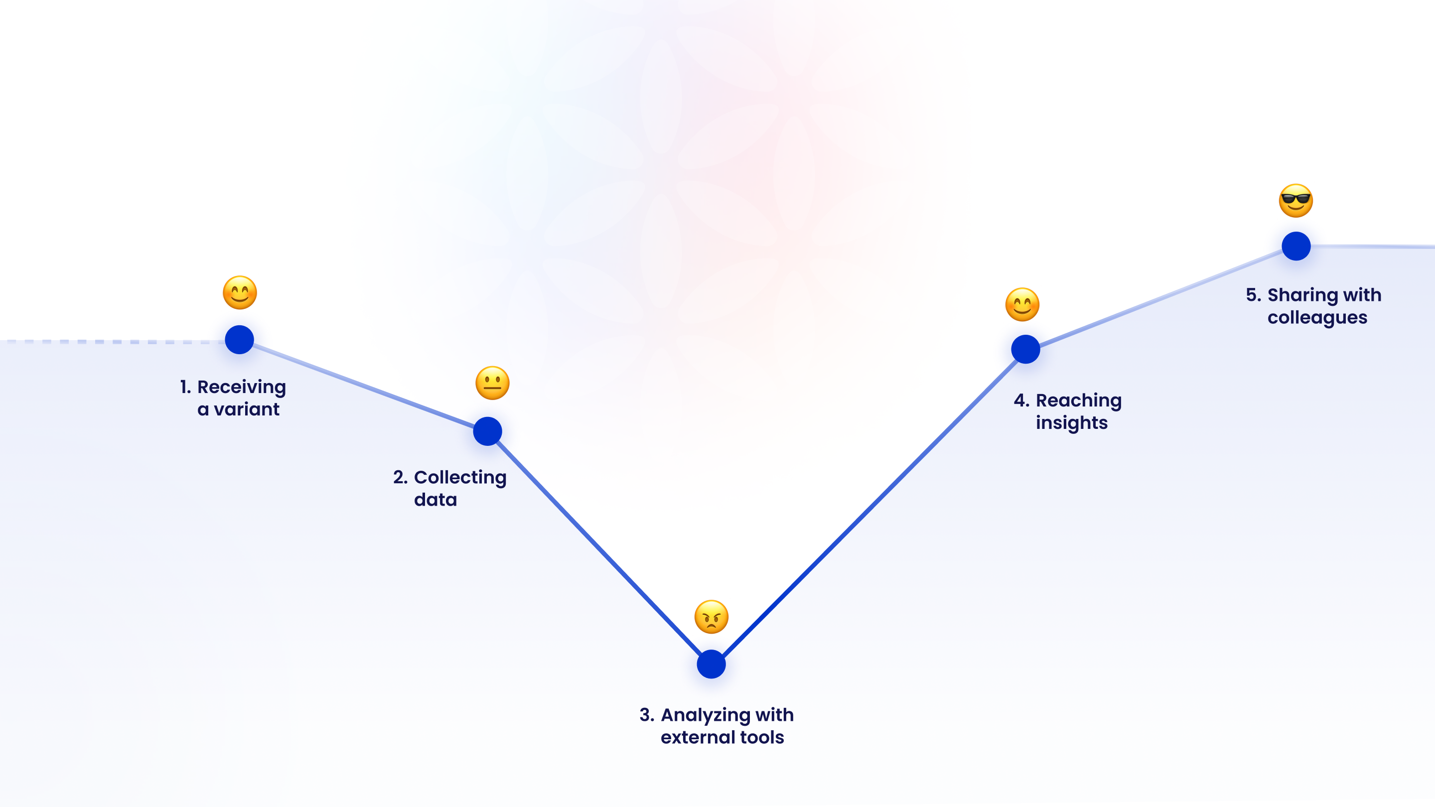
User Motivation Map
This map is based on domain knowledge and expert input. It shows how researchers feel at each stage of the genetic analysis process — from excitement to frustration to satisfaction — to help guide user experience design.
1. Excitement, high motivation – a new case with discovery potential.
2. Neutral – a technical step, sometimes frustrating if data is incomplete.
3. High frustration – manual, fragmented workflow with multiple tools. Sometimes, the case turns out to be irrelevant mid-way.
4. Satisfaction – meaningful conclusions are finally reached.
5. Happy – the process is complete and results can be shared.
User Flow
Direct quotes from interviews with biological researchers helped us understand their pain points, motivations, and expectations.
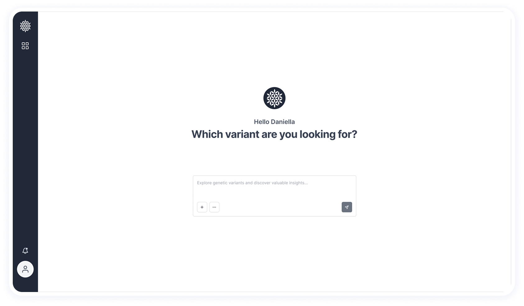
1. Enter the name of the genetic variant or mutation
2. Choose whether to refine the analysis using three optional questions
3. Fast automation and data processing
4. The research is delivered as a presentation, including all findings and disease classification
Enter the name of the genetic variant or mutation
Choose whether to refine the analysis using three optional questions
Fast automation and data processing
The research is delivered as a presentation, including all findings and disease classification
Wireframes
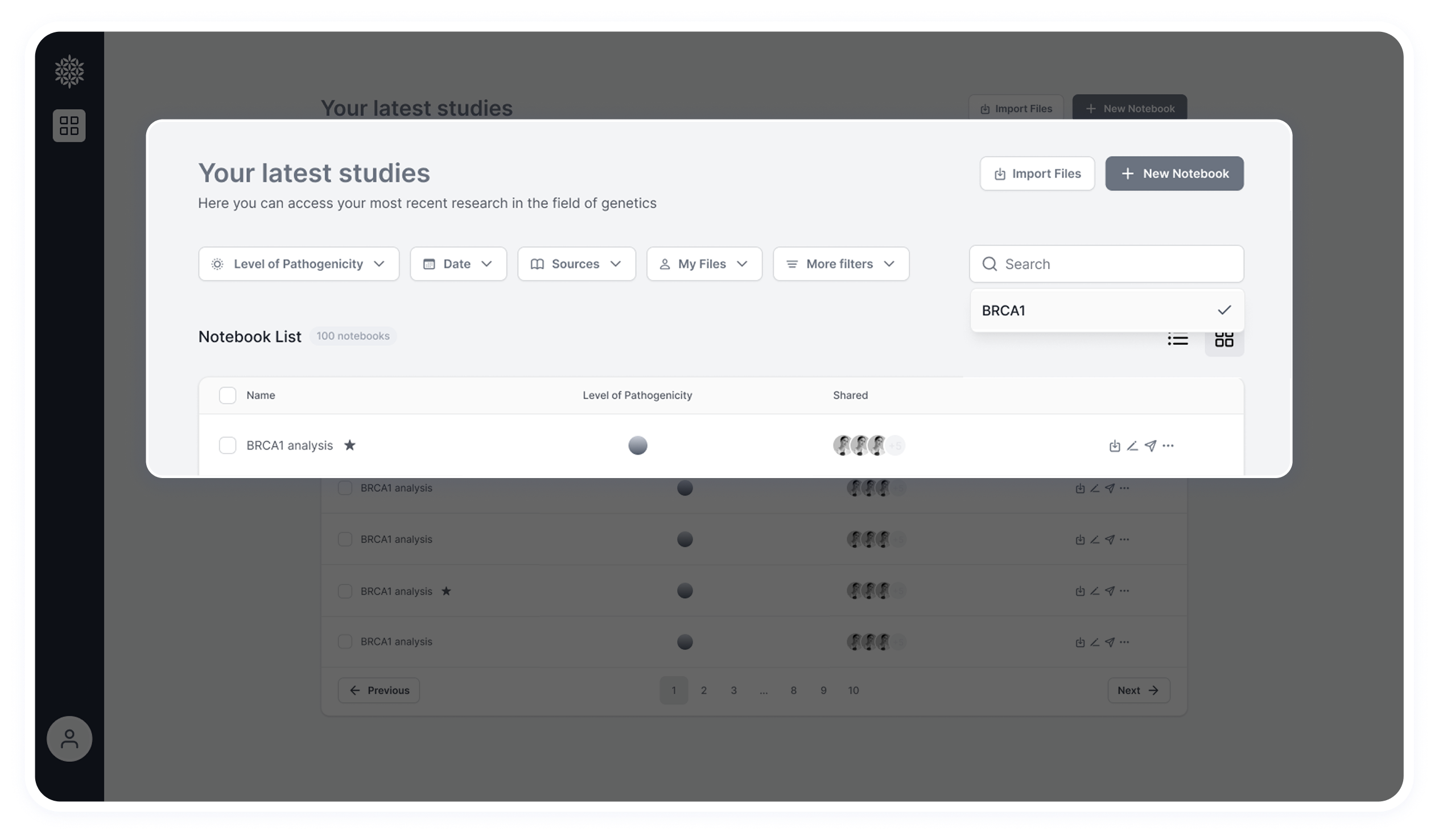
Dashboard
A dashboard displaying all previously analyzed variants.
Each card represents a variant that was entered and processed, including its result.
A color-coded pathogenicity score appears directly on the card — so researchers can see the outcome without opening it.
Variants can be prioritized by marking them with a star Shows which collaborators were shared on each case or presentation
New notebook
Top Section (Filtering & Notebook Creation)
Based on user feedback, researchers prefer to filter primarily by pathogenicity score.
Additional filter options and a search field were added for flexibility.
From this section, users can also create a new notebook and upload additional studies
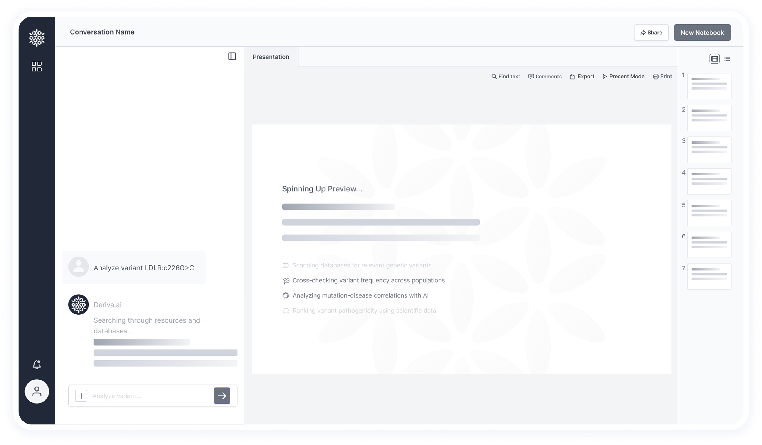
Loading & Search Feedback
In this part of the interface, we intentionally emphasize the loading and search process. Showing that the system is actively scanning and retrieving data adds to the sense of transparency and trust
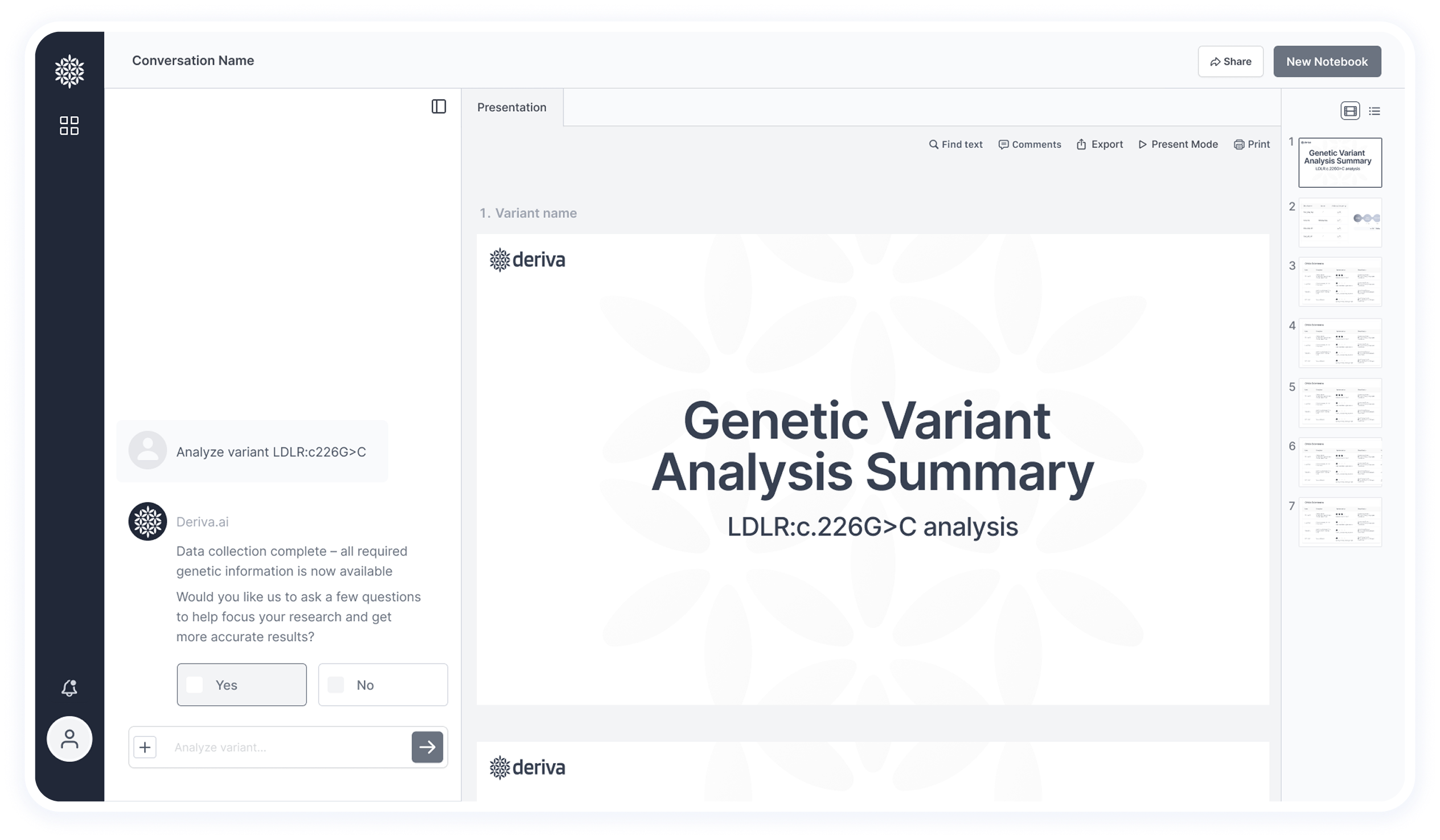
Post-Processing State
This screen shows the final results after data extraction and analysis — including insights and pathogenicity classification.
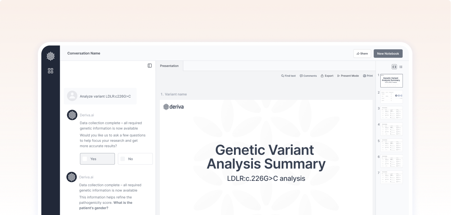
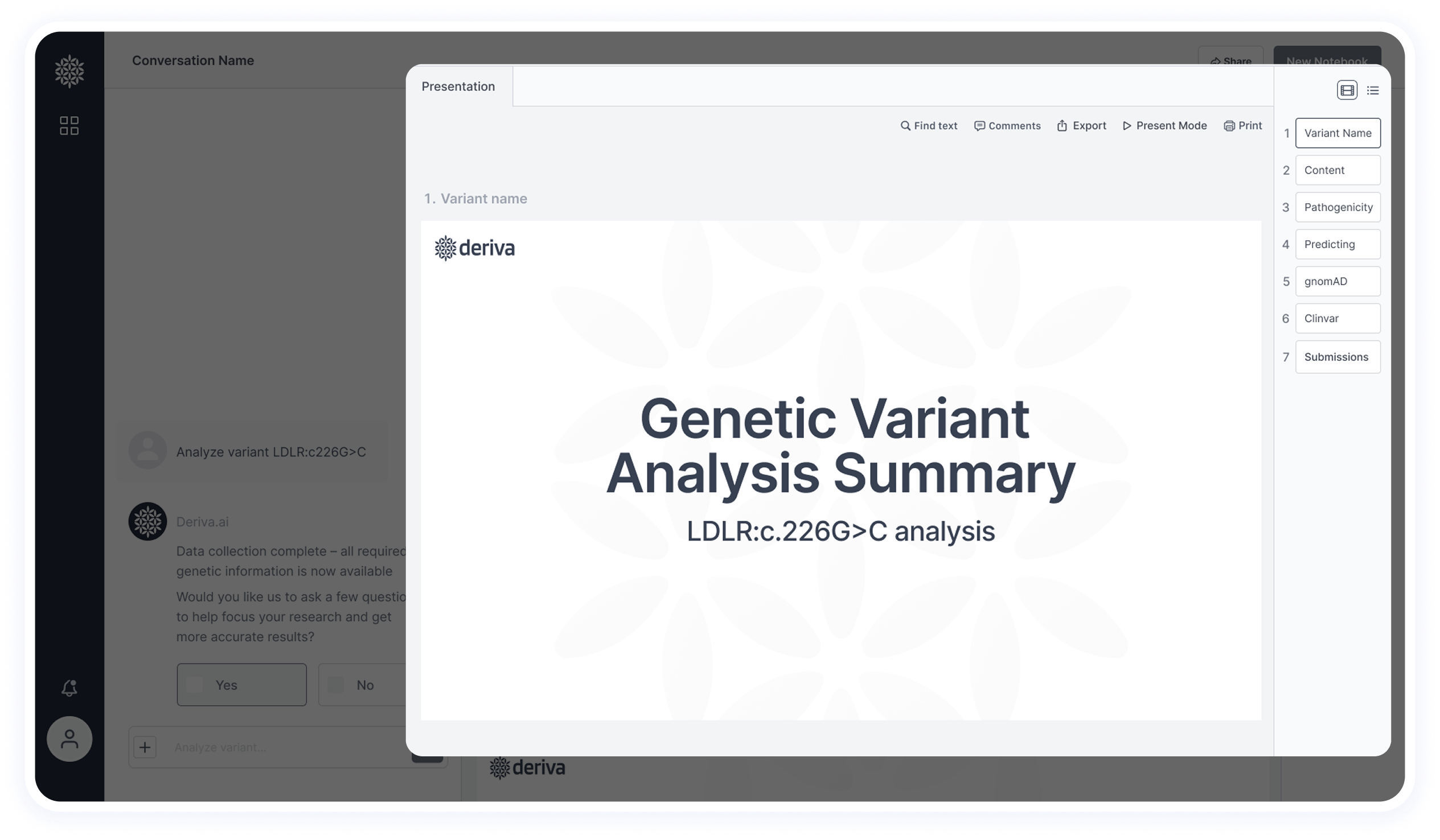
Presentation View Area
This section displays all extracted research information
The main content is shown in a central slide view, with a side panel for easy and visual slide navigation
Users can also switch to a list view to see just slide titles without visuals
At the top, users can search by keyword, view all comments in a side panel (similar to Figma), export, open in full-screen, and print the results.
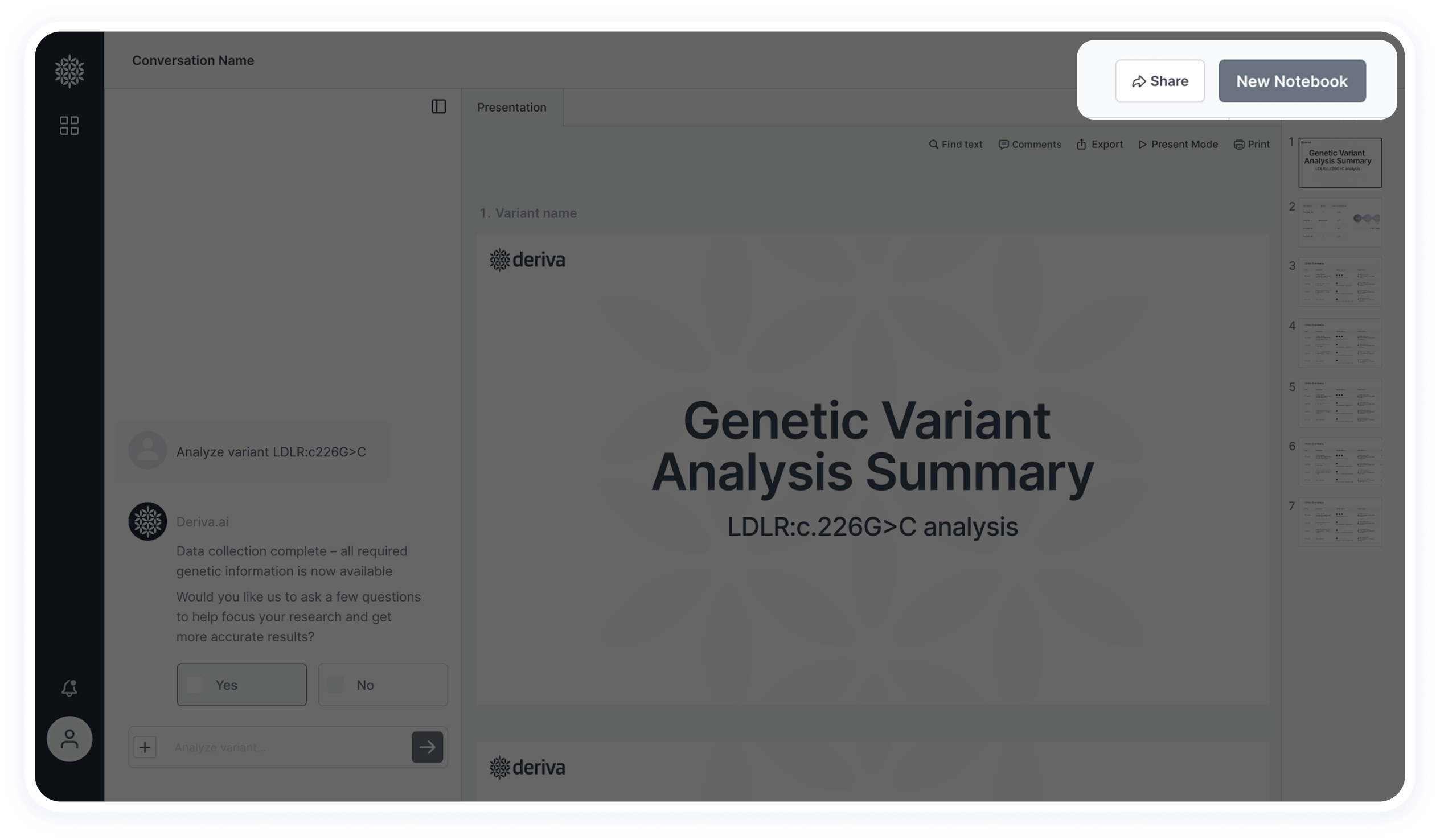
Header
This section was simplified based on user feedback. Originally, it included tabs for switching between multiple variants, but it created visual clutter and wasn’t aligned with researchers’ workflow — they usually focus on one variant at a time. Now, the header includes essential actions like creating a new notebook and sharing with colleagues.
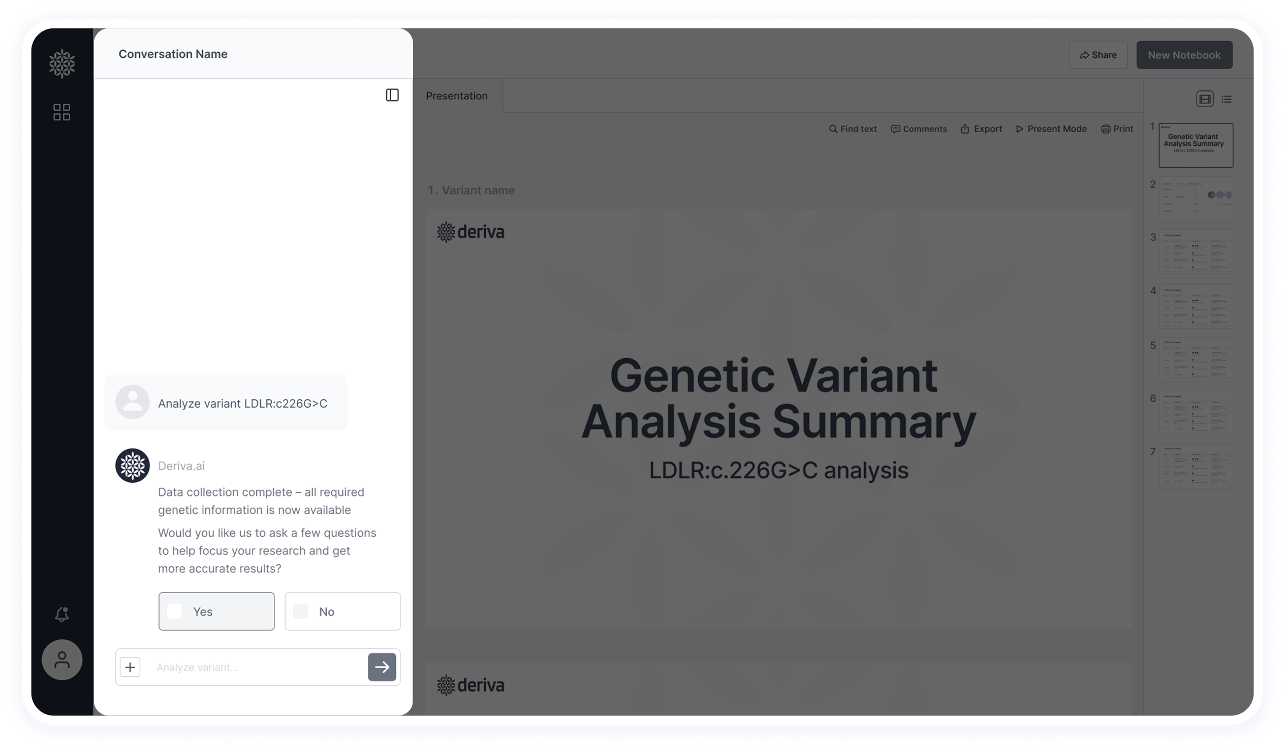
Chat Interaction
The chat combines open input with structured Yes/No questions to refine results and guide the research process more efficiently.
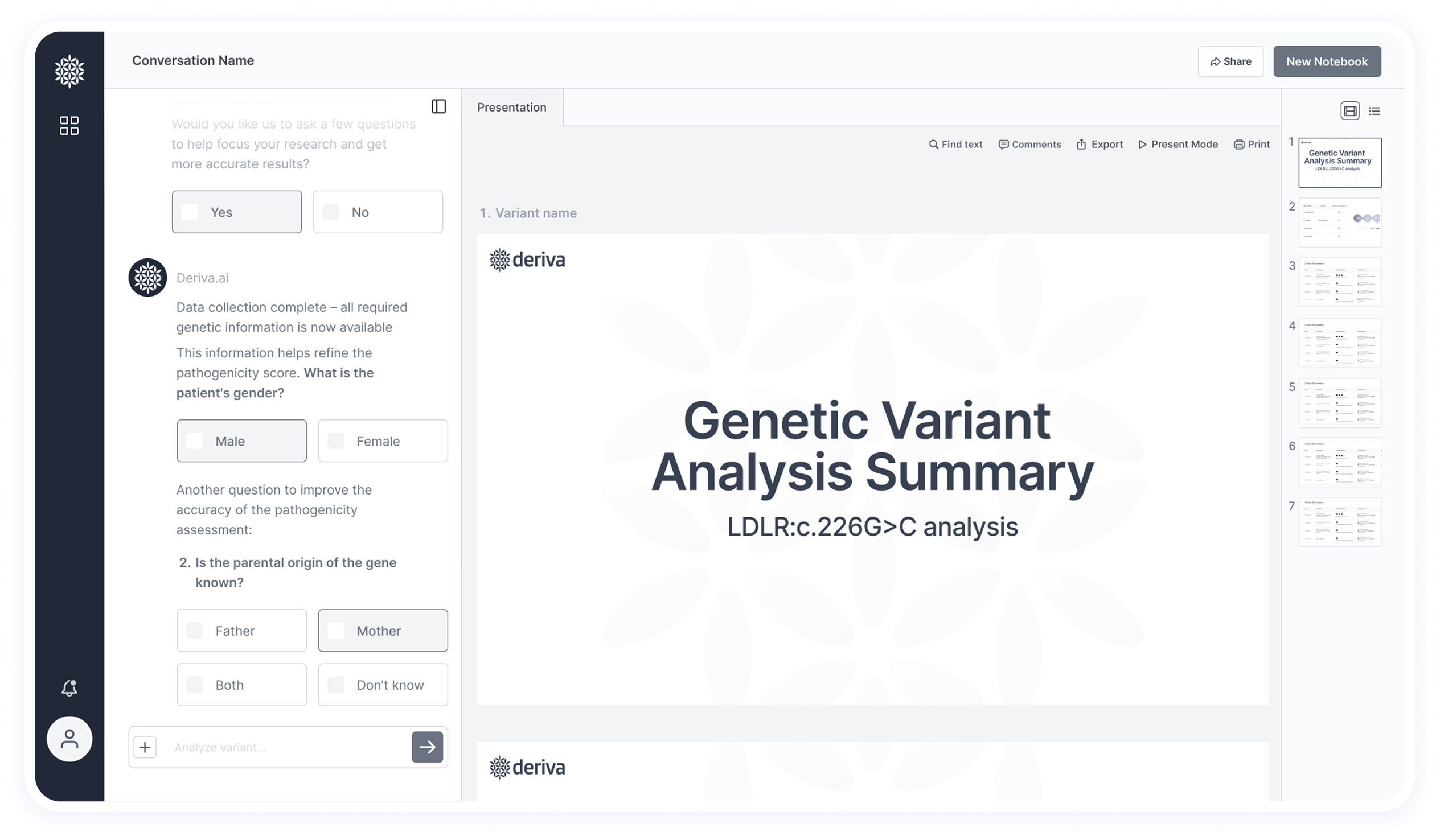
Structured Questions in Chat
Some questions were identified as both automatable and essential for pathogenicity scoring — for example: the patient’s sex, inheritance pattern (mother/father/both), and ethnic background. These are provided directly through the chat as part of a streamlined, interactive experience.
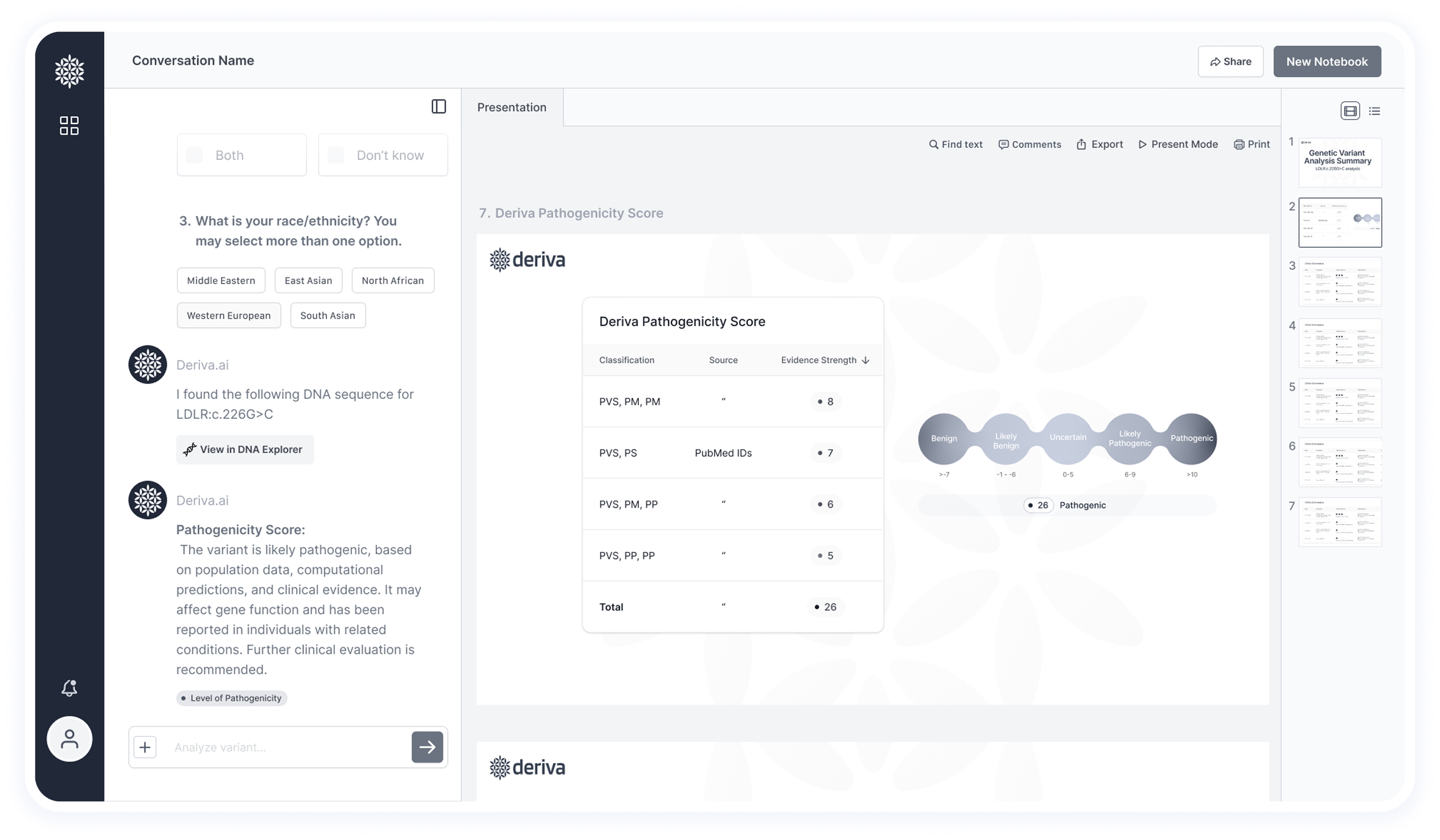
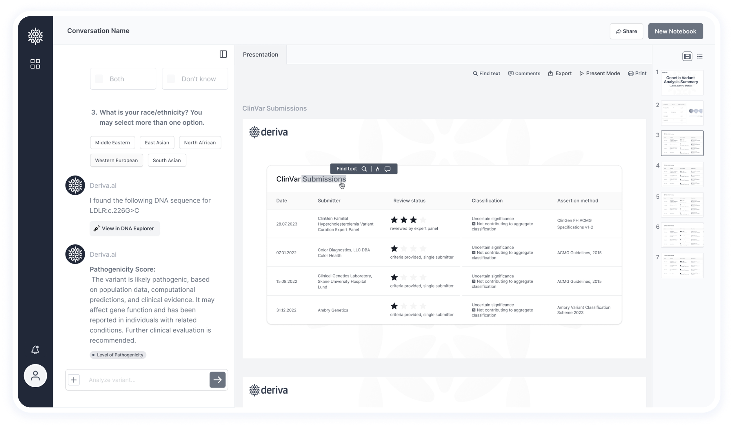
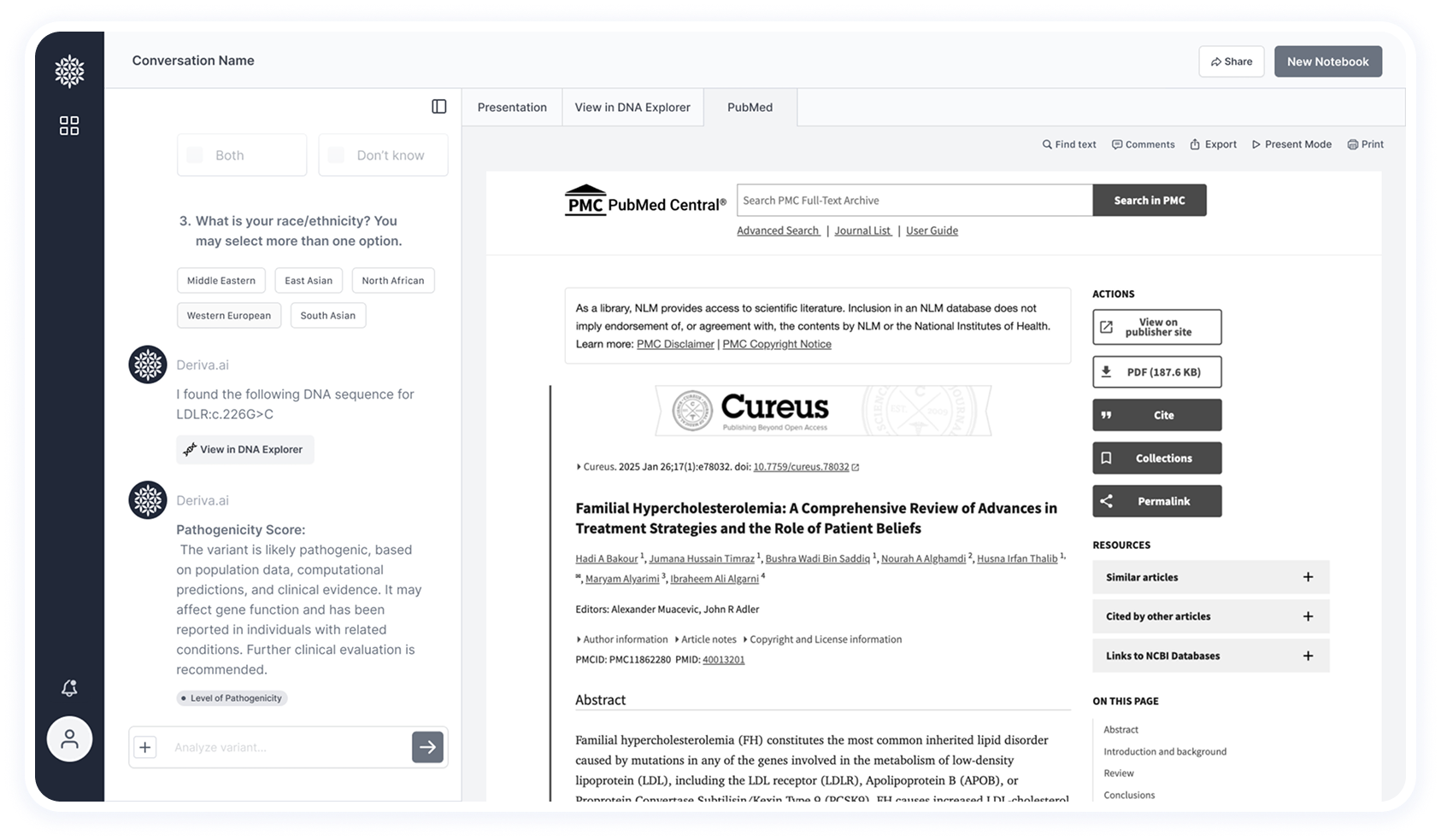
Score Explanation View
This screen shows the variant’s pathogenicity score. Since users wanted to understand how the score was determined, a detailed table explains the reasoning, and the full presentation includes source links.
On the left, the chat provides a text summary of the research and conclusion, displayed alongside the presentation.
Users can highlight content and leave comments, with the option to tag colleagues in messages.
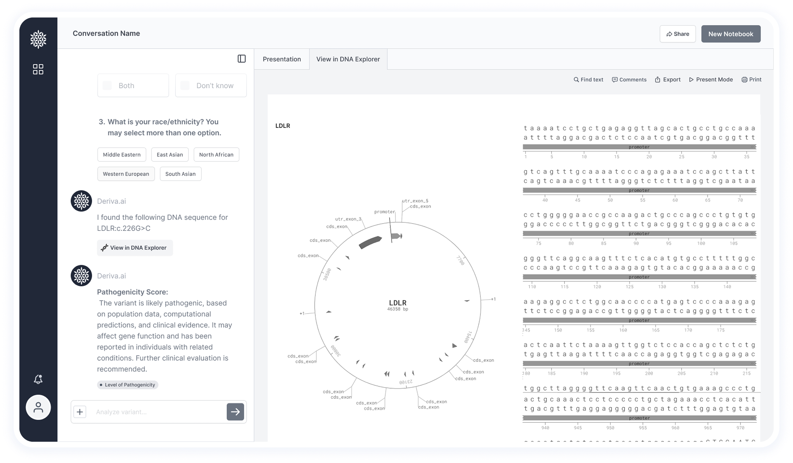
Visual Data Tab
Certain research cases include important visual elements, such as protein structures. These are displayed in a dedicated tab to support deeper scientific analysis.
Visual Data Tab
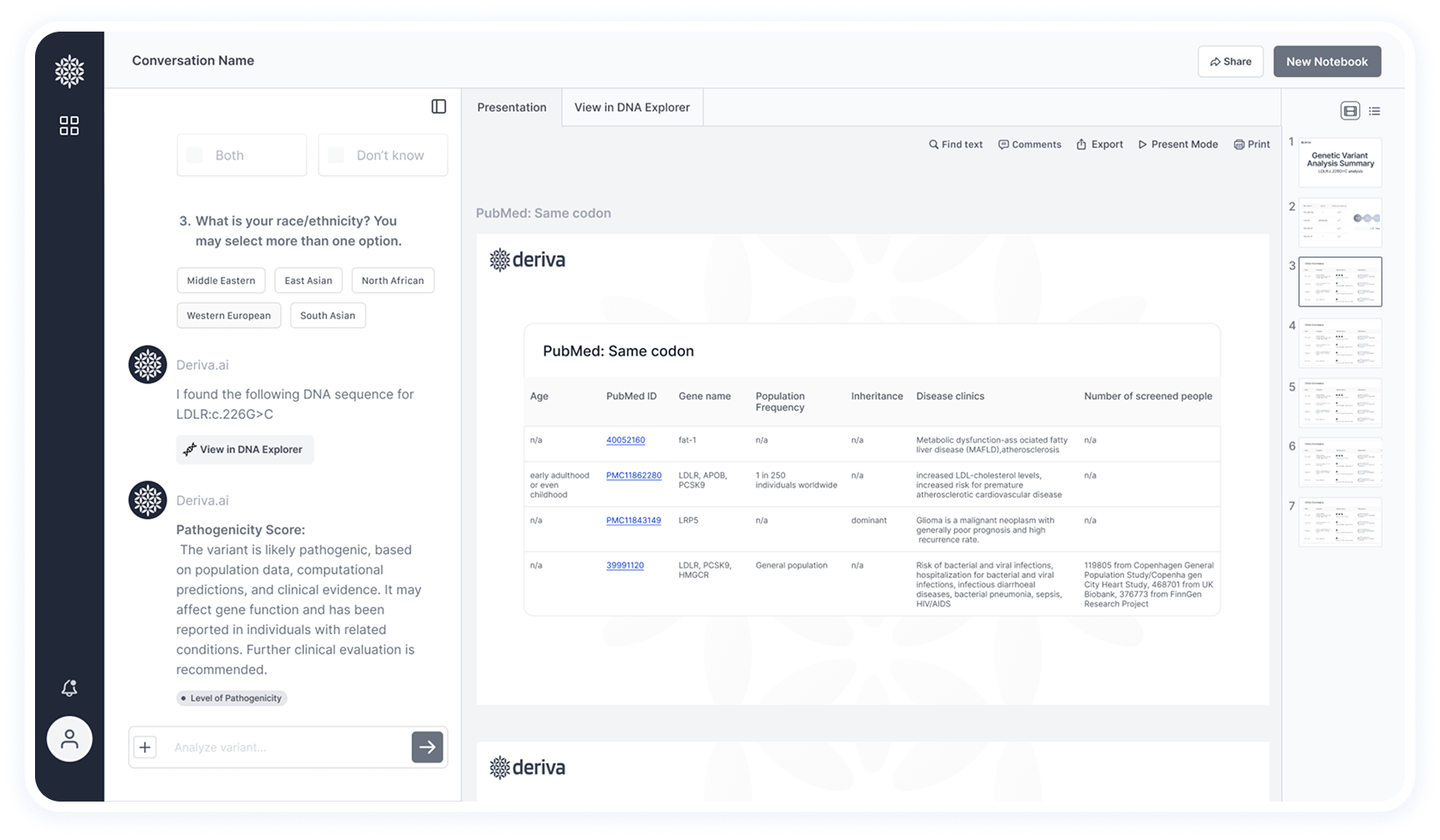
The chat provides chapter-like content headings that allow users to navigate directly to related slides.
In this screen, Deriva also filters and ranks relevant articles, presenting them in a table sorted by importance.
Each article includes a clickable link for quick access to the full publication.
All-in-One Research Experience
Deriva aims to keep the entire research workflow within the interface, without the need to switch between tools. To support this, internal tabs are used to display all necessary content directly in the platform.
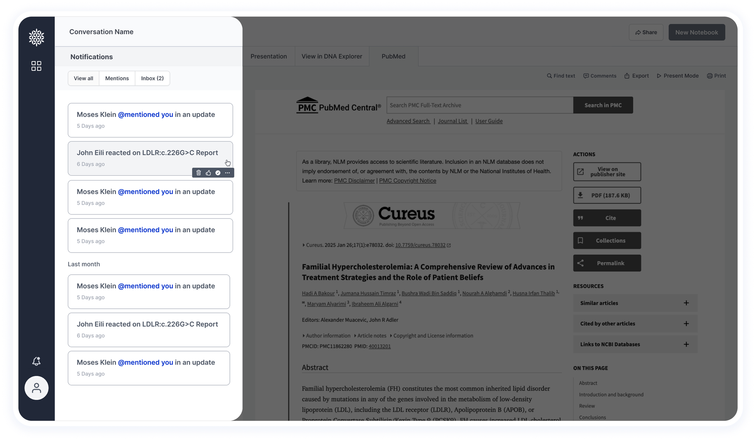
Notification Feature
Based on insights from the user survey, notifications are highly valuable for researchers. They are used to alert users when new information becomes available or when another researcher mentions them in a shared study.