Type: Real project (Designed at Reut Toker Studio)
Scope: UX Research, UI Redesign
Goal: Redesign a complex internal system to make it clearer, faster, and easier for employees to complete service-related tasks.
Challenge
The system was hard to use and caused confusion and delays, especially for elderly users.
Solution
I redesigned the interface with clearer feedback, simpler layout, and guided input to make tasks easier and faster.
Project Overview
This case study focuses on redesigning the system to improve efficiency and usability, especially for older employees who struggle with technology and find the interface difficult to use.
Background
Phoenix’s platform scans insurance documents and fills structured fields to reduce manual work, but automation gaps and usability issues revealed the need for a more efficient user experience.
User Research
I used a short questionnaire to identify user struggles, slowdowns, and how to better support older, less tech-savvy users.
Findings and Conclusions
👨💻 Unreliable Automation
Users said the system didn’t always recognize data, so they had to fill in fields manually.
🧭 Disrupted Workflow
Users had to switch screens and scroll repeatedly to complete simple tasks, which slowed them down.
😕 Confusing Interface
Elderly users found the interface overwhelming, with difficulty reading small text and understanding the layout.
⚠️ Missing Feedback
Users said they didn’t receive any explanation when something went wrong. This left them feeling confused.
The Problem
The users faced multiple challenges that reduced the system’s usability and employee efficiency:
❌ Incomplete Auto-Fill- The system didn’t always recognize document data, leading to unnecessary manual input.
❌ Inefficient Workflow – Users had to switch between multiple screens and scroll excessively to complete basic tasks.
❌ Unfriendly UI & Visual Overload – Poor visual hierarchy, small clickable areas, and low contrast made it hard for elderly and less tech-savvy users to navigate and understand the interface.
❌ Lack of clarification
- No indication why data couldn’t be entered automatically, which led to confusion.
Personas
To better understand the users, I created two personas: Sarah and Alex. Both of them face challenges with the current system, but in different ways.
Sarah
Senior employee
Pain: She finds complex interfaces overwhelming and struggles with too much on-screen information
Need:
A clear, simple system with guidance and feedback
Solution:
Clean layout with collapsible sections and clear notifications to reduce visual noise.
Why it fits:
Helps her stay focused and confident while working
Alex
Mid-level employee
Pain: He's slowed down by manual data entry, unclear errors, and inefficient flow
Need:
A faster system with automation and quick error handling
Solution:
Real-time validation, field error highlighting, and focused notifications
Why it fits:
Reduces delays and helps him stay productive
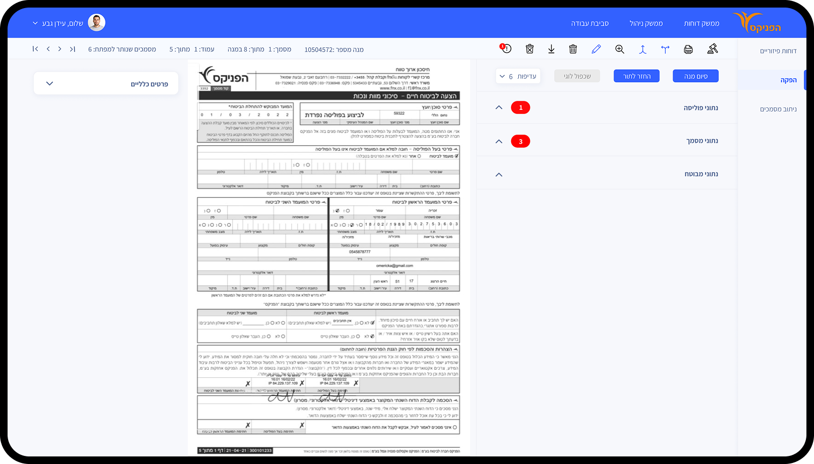
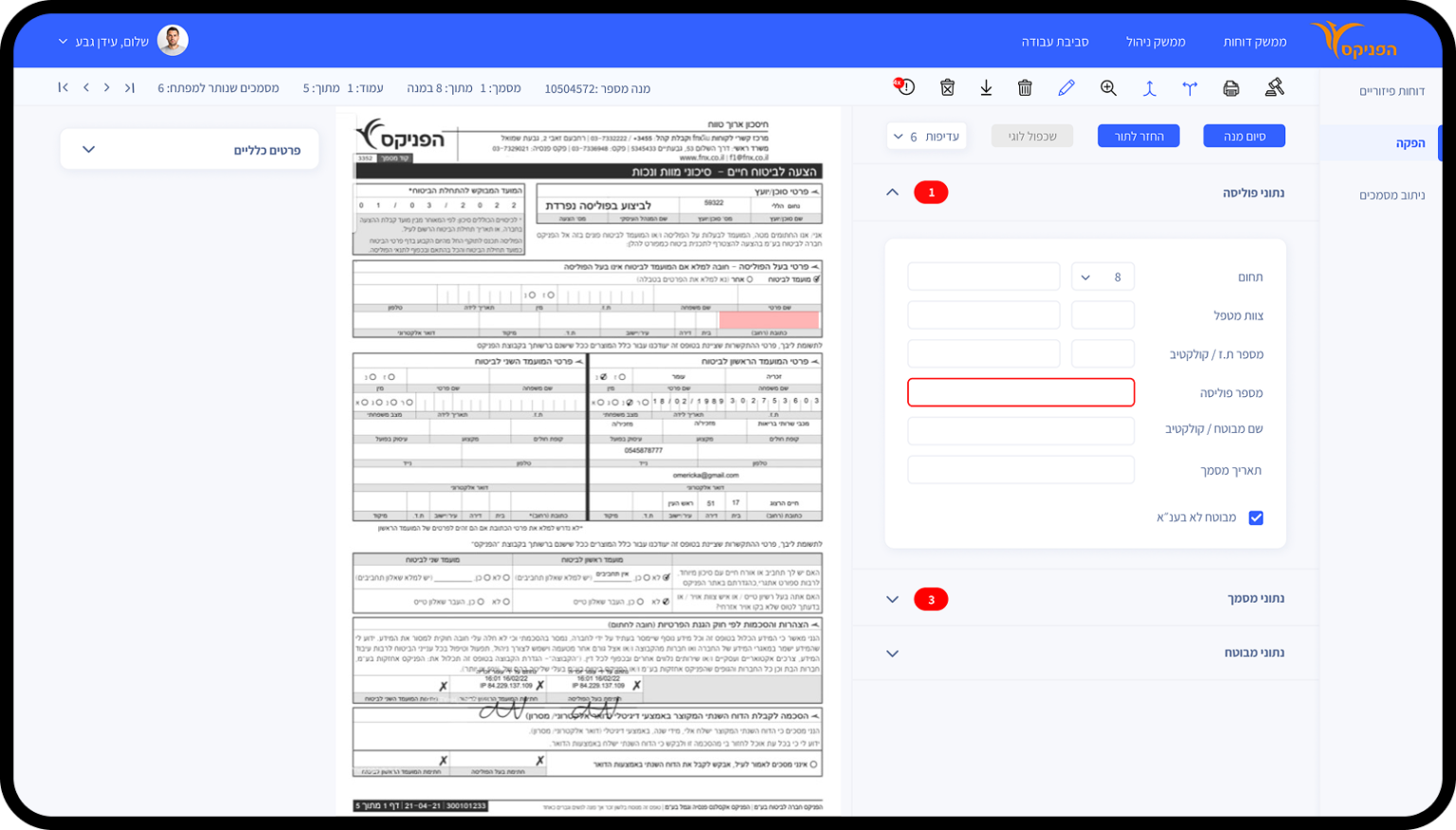
The Solution
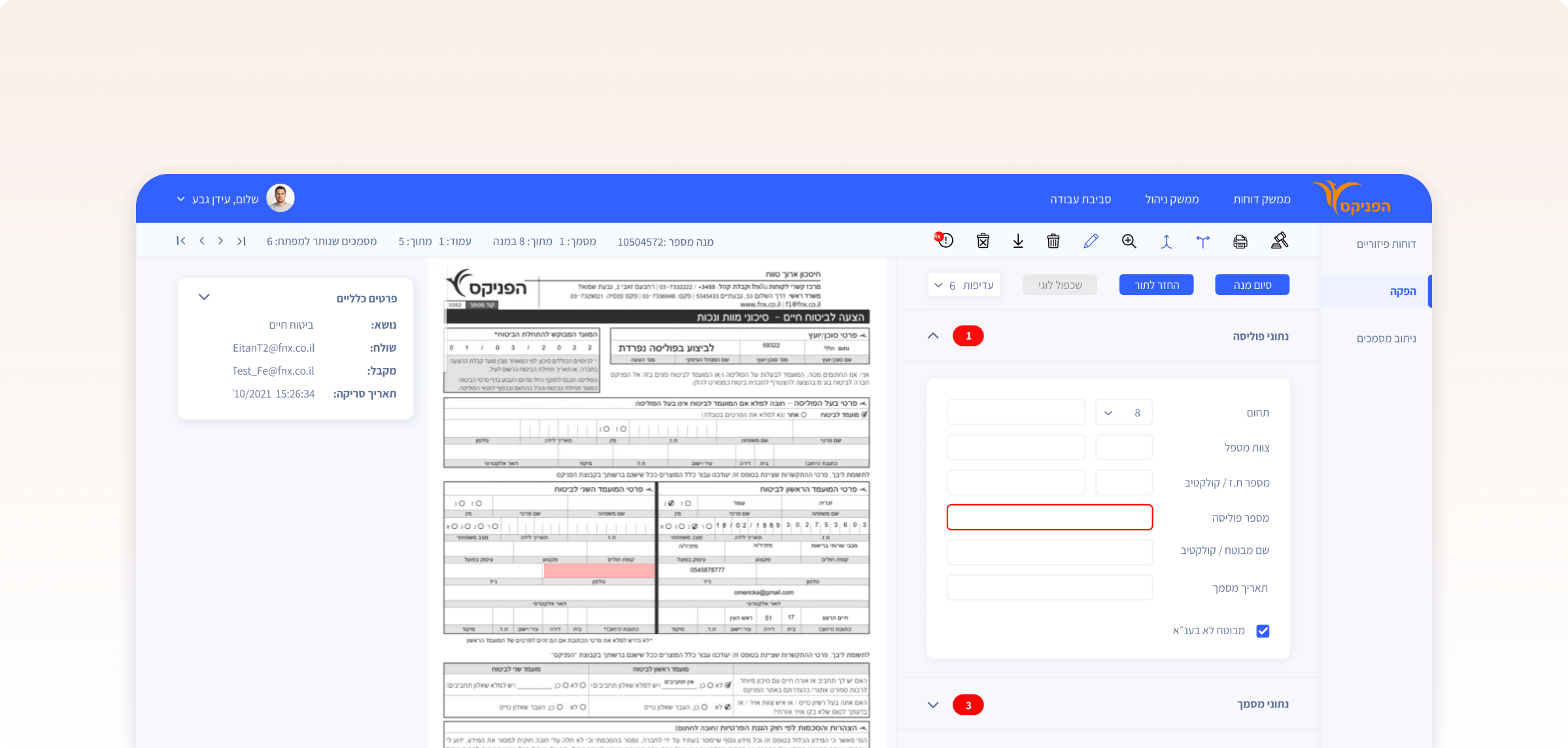
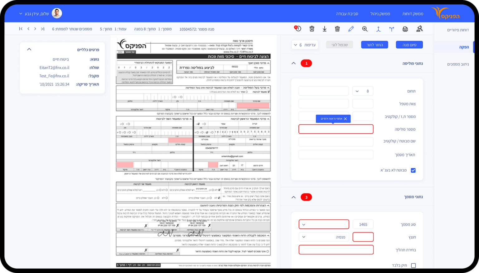
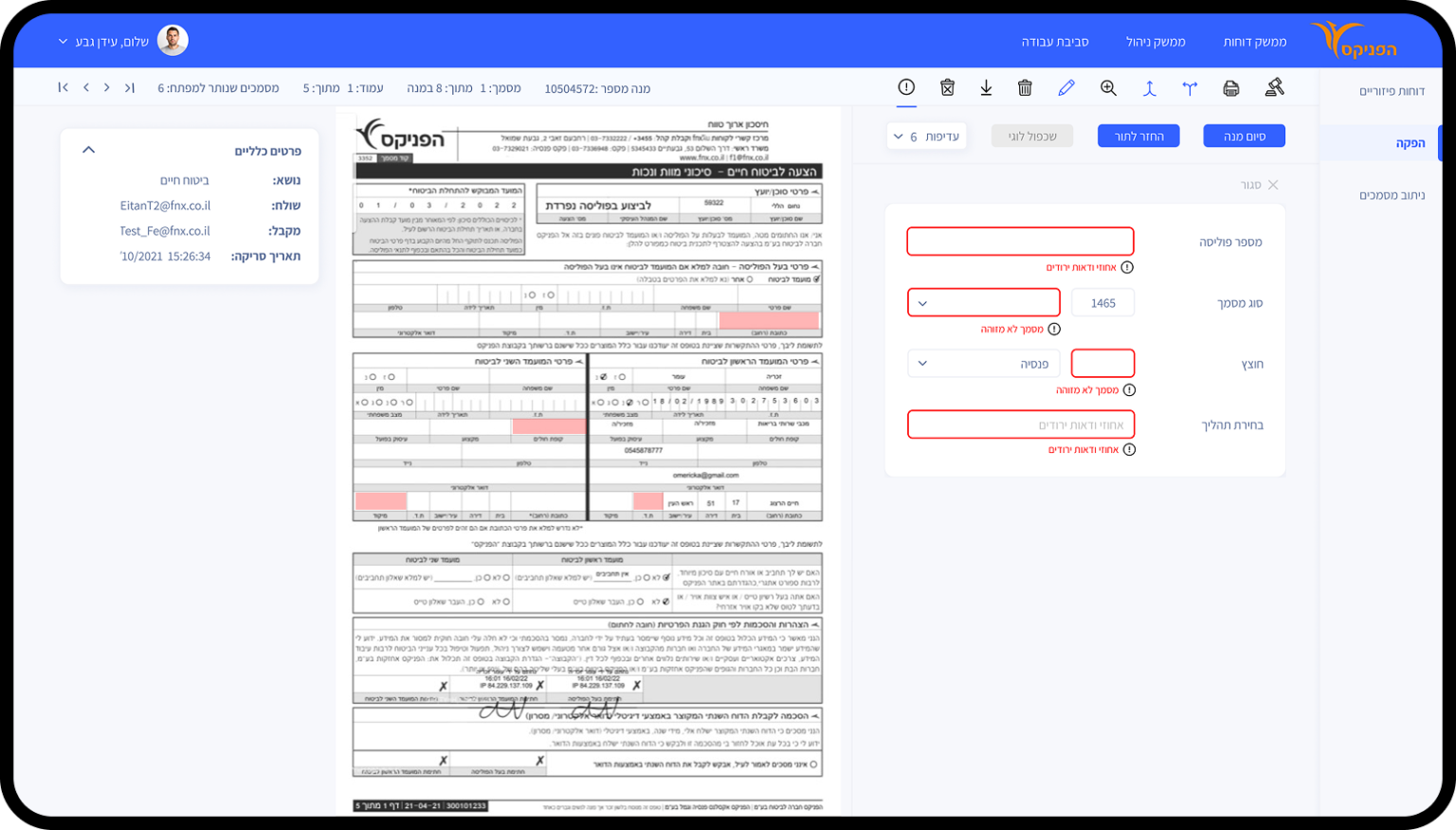
✅ Assisted Input Design: When automation fails, the UI marks the problematic area on the document and the related field — making it easy to spot and fix.
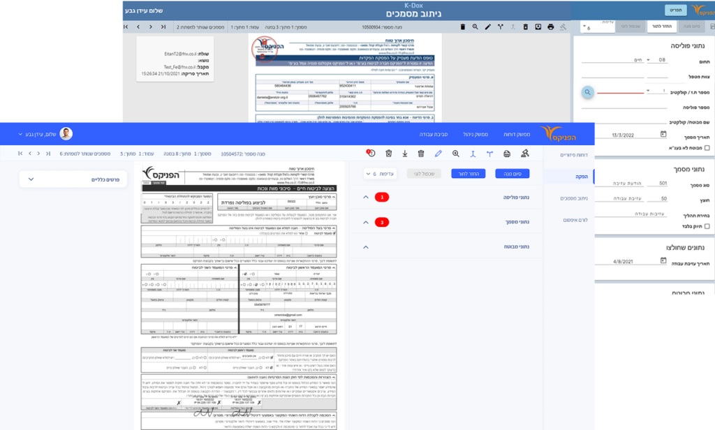
✅ Streamlined Navigation: Reduced the number of steps, minimized screen/menu switching, and limited unnecessary scrolling to improve task flow and speed.
✅ Improved UI & Accessibility: Intuitive layout, large clickable areas, readable fonts, clear hierarchy, and high-contrast colors — designed to support elderly and non-tech users.
✅ Real-Time Feedback: Alerts users when data can’t be captured automatically, so they understand what went wrong and what to do.
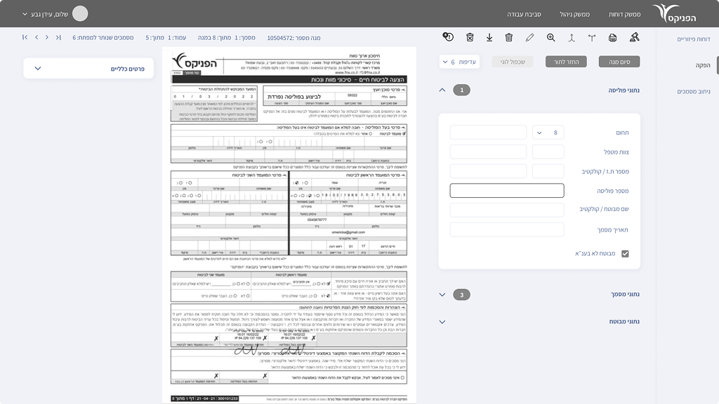
Wireframes
Research showed the system’s structure needed to be more open and visible to allow smoother, faster navigation across the workspace.
🧭 Unified Navigation Design
Position the main menu at the top with a secondary side menu, ensuring clear hierarchy and seamless transitions between areas.
🧠 Simplified Navigation
Drop-down subtitles make information easily accessible, reducing scrolling and cognitive strain.
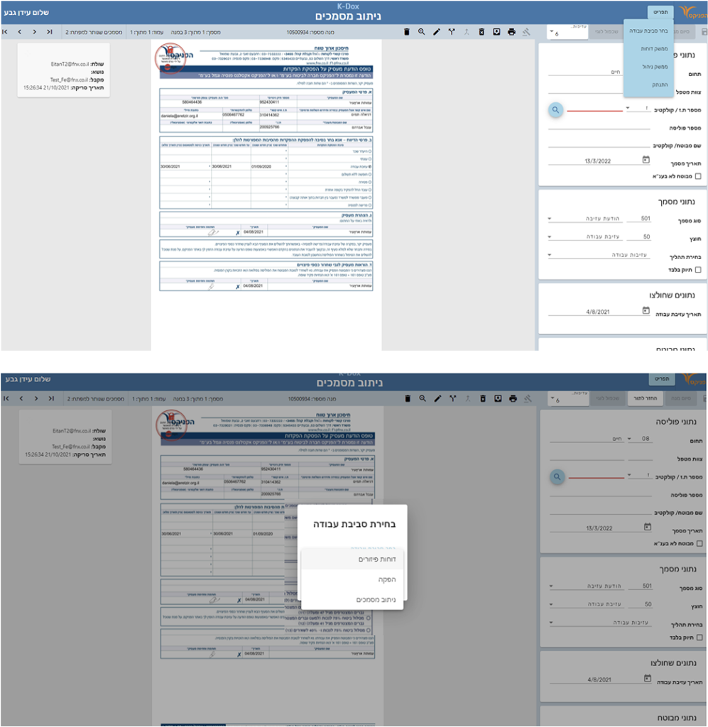
🔔 Notifications
Receive alerts within the dropdowns, so you only open what needs attention—enhancing efficiency and engagement.
🚀 Streamlined Problem Solving
We've created a dedicated space for unrecognized fields, making it effortless for employees to tackle system recognition issues in one place.
📌 Marking & Tips
We highlight ID problems on documents and offer helpful tips right on empty fields for easy issue resolution.
Final Design
Taking into consideration the main topics that came up in my research, I aimed to create a clean and very clear design with a bright, and contrast colors. So that they attract the attention of the users and highlight the problems